The forgotten retail sector

When WheelFreedom asked Retail Experience Design to help create something completely unique in the mobilty retail space, we knew this was an opportunity to create something unparalleled in the industry.
But more than that, our design thinking would have real purpose, responsibility, and the potential to transform the experience of individuals searching for the right mobility equipment.
In our recent article, we chat to Giles Donald, WheelFreedom Founder about his decision to move into the physical retail environment, and Dean Waugh, Creative Director, Retail Experience Design about the design approach for Wheel Freedom’s advancement into bricks and mortar.
Mobility retail
The reality of mobility retail is a far cry from forward-thinking spaces and inspiring customer experiences.
The search and discovery of the right mobility equipment should be nothing short of an empowering and a positive experience. Yet, the reality of mobility retail is a far cry from forward-thinking spaces and inspiring customer experiences. For far too long, this growing sector has seriously lagged in the retail space – stores and showrooms clumsily overloading their retail space with products of all shapes and sizes, with no real consideration to the basic retail design principles or the customer experience.
What’s more environments can feel dated, and unconsidered, with little respect to the diverse range of customer demographics and their individual journey. All too often the approach is generic and targeted to the older generation.
On the other hand, customers can of course search and purchase online or by sales agents visiting their home, but how and why should they be expected to make life-changing product decisions without having the ability to feel, touch and experience beforehand?
It was some of these and challenges that inspired mobility retailer WheelFreedom with their vision to create a physical retail environment unlike anything before – a centre of excellence – a space where customers could feel positive and empowered.
WheelFreedom
Giles, tell us about WheelFreedom’s story?
We started as a hire service back in 2007 after experiencing first hand the challenges with hiring a wheelchair for an ill relative – a lack of quality and convenient options on the market, high costs, poor customer service, old stock and long waiting lists all contributed to making the process difficult.
The challenging experience inspired the creation of WheelFreedom.
Why move WheelFreedom into a physical environment?
We did some research and our customers told us although phone and home assessments were useful especially for first time users to identify initial need, they desperately wanted the option to see, touch and try products.
So, we wanted to create an uplifting, positive and comfortable retail experience for all customers – a unique space that provided everything they might need under one roof – assessments, access to specialists, opportunity see and try equipment, onsite workshop/ technicians.
How did you find the creative design process?
I really valued the regular communication and contact with Retail Experience Design throughout the design process – they didn’t’ just take the brief and return weeks later with final visuals – we had regular contact throughout the process where I had the opportunity to provide feedback.
This is my business, it’s my everything! So, feeling involved throughout the different stages was hugely important to me. The 3D visuals and mock-ups developed by Retail Experience Design gave me a real feel for the space, and really brought the designs to life, the 2D alone wouldn’t have done the same.
What parts of the project worked well?
I liked the idea of a working with smaller independent design agency, I thought this would be the best fit for my business, I didn’t want a massive shopfitter or design agency.
In terms of the design, what worked really well is how we considered what practically the space needed to do, rather than listing what areas we thought we needed and trying to make products fit in afterwards. This ensured that from the beginning the space was designed for the products, it wasn’t just about making a lovely looking space.
Finally, in terms of cost, we didn’t have a big budget, it was limited. Dean was very aware and cautious of this, but we pretty much hit bang on budget, without compromising design or finishes.
How would you describe the finished design and fit-out?
There is simply nothing else like what we have achieved, our mobility showroom stands head and shoulders above anything else in the market, beyond any comparison.
The quality and finish of the showroom design is both wow and practical – the space feels spacious, fresh and calm, a really nice place to be in – a completely new level for the industry.
Dean, what was the design brief?
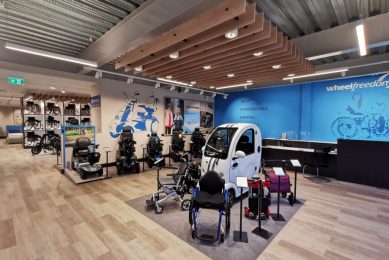
Our brief was to achieve an experience led space to exhibit WheelFreedoms large array of mobility equipment – a forward thinking, flexible and highly practical design, within a limited budget.
The size and scale of the unit was considerable to accommodate the volume and size of WheelFreedoms product range, as well as the various aspects of the business, including the technical workshop, assessment and consultation areas and retail.
It was essential the interior design was sensitive to customers’ needs, placing them firmly at the centre of the store design, whilst creating a journey and experience that left customers and their families feeling positive, informed, and empowered.
Dean, talk us through the design approach
We wanted the space and customer journey to tell the WheelFreedom brand story, so the development of the brand and its integration into the retail environment was an integral part of the project.
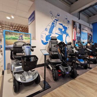
Building on the brand signature colour, we created bold bespoke illustrations, aspirational lifestyle photography and statement brand messaging to build a connection with the customer and create impact. The strength of the new branding would help to elevate the space and avoid the space feeling like a warehouse.
The development of large format branding and graphics to the perimeter space also allowed us to focus on applying more detail on the key touch points, such as the sales counter, consultation zones and creating unique feature areas within the displays. We used considered finishes and materials for fixtures and fittings, and our holistic design approach ensured the compete space looked and felt connected.
What’s more, the full height illuminated feature display cube deliberately relies on the high-powered wheelchairs to transform the cube into a striking design feature that catches customers attention when they walk into the space.
Dean, what did the design achieve?
As a design team there were several stand-out design elements that relied on our creative ability, technical expertise, design thinking and retail/industry experience. These included the brand development which cleverly achieved a fresh, aspirational, and confident interior design; the skilful manipulation of the space which accomplished the right balance for the customer flow, ensuring customers felt comfortable and at ease navigating through the carefully considered walkways; and the strategic presentation of products.
Crucially, the design is sensitive to the customer and their needs, the customer journey and touch points ensure adequate personal space, whilst providing the opportunity to really understand the products, their features and benefits.
Our key challenge was how we could get the most out this big space on a limited budget, whilst delivering an engaging, positive, and highly practical showroom design, and I think we absolutely nailed it. A fresh and highly effective design, a first in this typically traditional and overlooked area of physical retail.

Get in touch with us today
Whether you’re relocating, refocusing, renovating or repositioning, we have the experience to make your space a success.
Contact us


