Showroom Design: Creating spaces that educate, engage and inspire
A showroom is more than just a gallery. It should be an interactive environment that stimulates, educates and most of all inspires.
When leading global manufacturer and suppliers of cable management products HellermannTyton asked Retail Experience Design for their help on how best to showcase their networking components to customers and buyers, we knew we had a challenging design brief on our hands. After all, how do you create a customer environment showcasing ‘tech kit and components’ for networking solutions look inspiring and feel engaging to buyers? But we like nothing more than a good design conundrum to get stuck into. So, here’s what we did.
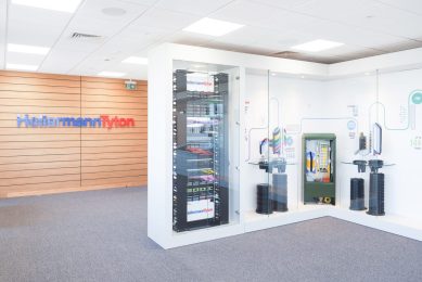
HellermannTyton recently moved to a new manufacturing site in Northamptonshire, which also included staff offices and showroom area. Our brief was to transform the existing showroom space from a bland, unconsidered environment, where world-class products were positioned on stems and mental rods, into an impressive and inspiring space.
As a global brand and market leader, the showroom demanded a design that conveyed the scale and strength of the brand as well as the world-class products. Despite the products not being physically or visually attractive to showcase, HellermannTyton had a powerful and fascinating story to convey from both a brand and a product perspective. It was this story that formed the basis of our design concept and foundation for the customer journey.
Our new concept completely discarded the use of metal rods and wires for displaying the products as they devalue the product being displayed. Instead, we created an interactive product display wall. The wall consisted of full height high gloss MDF glass cabinet style units, which included various shelving and display structures to create a sense of the products floating rather than being connected to bulky mechanical rods. By displaying the products behind the toughened glass with varying display and structure tactics the products immediately reflected their significance and value.
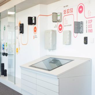
Interaction between buyers and products was key, so we implemented touchscreen technology that created experiential elements throughout. The branding and graphics were fundamental in the overall concept design. A timeline was created to connect the brand and product, providing a rich experience that was both educational and inspiring. The graphics not only had a key role in storytelling but added personality and worked hard to engage with customers and buyers.
In our opinion, a showroom shouldn’t just be a gallery – it’s an environment that needs to stimulate, educate and inspire. With HellermannTyton our vision was to create a rich experience where the brand story and product worked together to create a compelling environment and lasting impression, with the ultimate objective of driving sales. And we think we did exactly that.
Check out how we made technical kit look and feel inspiring to buyers through creative space design.
Get in touch with us today
Whether you’re relocating, refocusing, renovating or repositioning, we have the experience to make your space a success.
Contact us


